


2021
Voltality explores making it easier for young adults to find volunteering opportunities online. My team designed a social media platform and mobile app that connects volunteers to each other and matches them to volunteering opportunities.
As part of a Master’s course in Human Centered Design, I collaborated with three classmates to design a volunteer-matching UX design solution from scratch. While I made hands-on contributions to every phase of the project, I led the concept ideation and worked with another teammate to design a Figma prototype.
How might we make it easier for young adults to find volunteering opportunities online that include critical information for them to make informed decisions?
Young adult volunteers in the United States find it difficult and time-consuming to search for volunteering events, especially those that specifically align with their professional skills and that have opportunities for remote or long-term work.
Our final design solution is a digital social media platform that allows volunteers to easily discover volunteering opportunities that align with their preferences, connect with organizations, and be inspired by other volunteers’ experiences.
Event Matching Feature
Matching Inbox & Event Cards
Swipe through a list of event cards that are matched to the user's preferences. Bookmark the card to save the event, or archive the card to dismiss it.


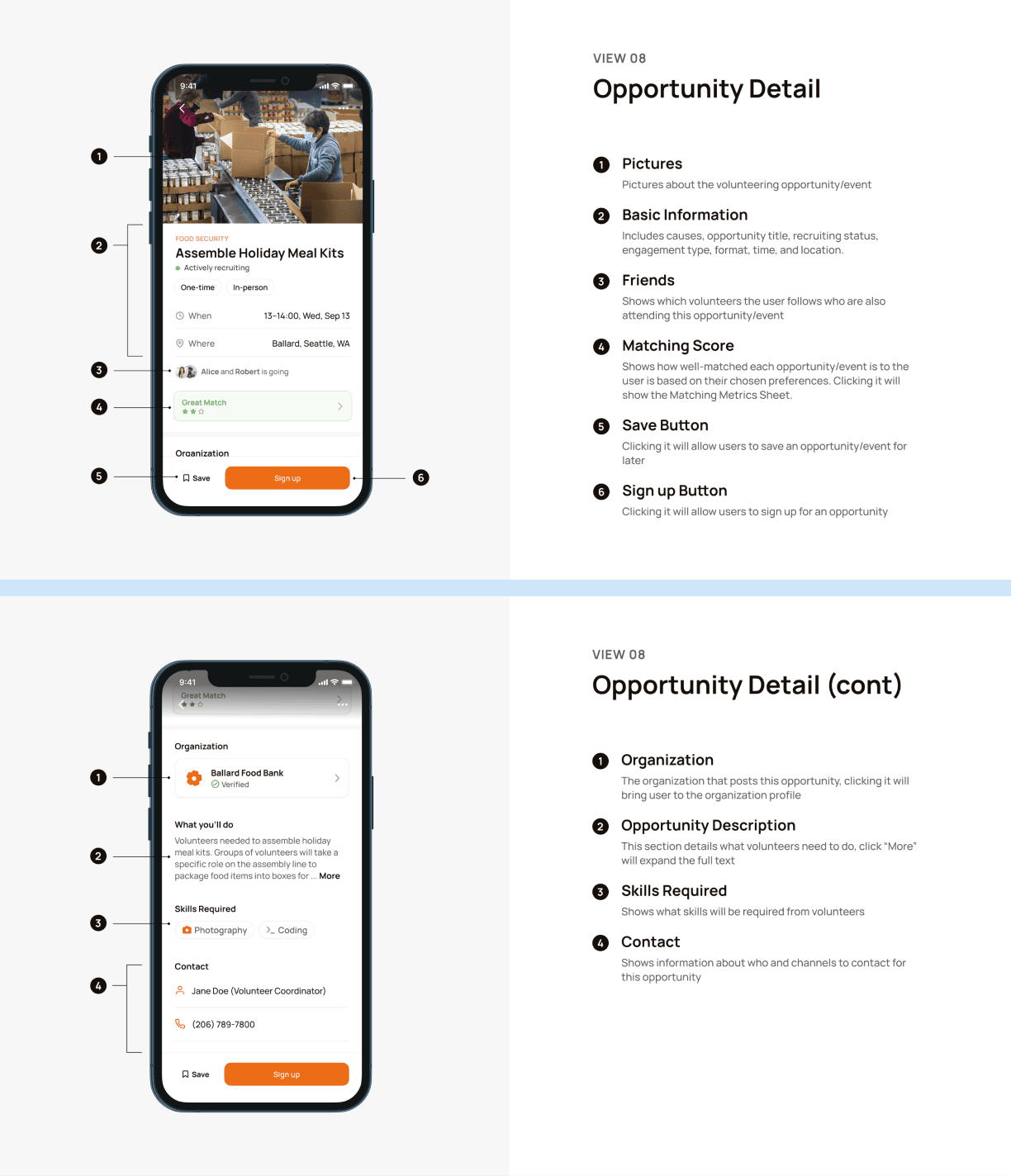
Opportunity Details
See all the information a volunteer needs about a volunteering opportunity.
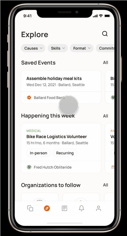
Explore Feature
Easy-to-use single page to view saved events, events happening this week, and suggestions of organizations to follow.

Community/Social Media Feature
Community Feed
A social media feed with posts from volunteers and volunteering organizations to be informative and encourage connection.


Volunteering Organization Profile
An organization's page that displays upcoming events and essential information.

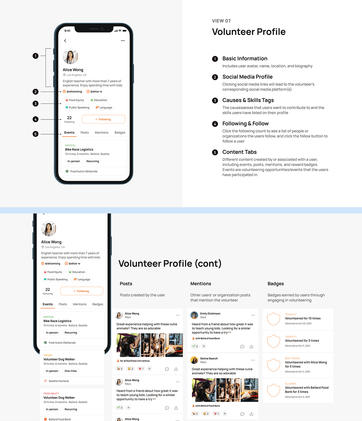
Volunteer User Profile
A personal profile that stores event attendance and post highlights.
Design Process

Expand full process ↓