Washington Trails Association
Visual System Redesign
I gave Washington Trails Association a makeover, redesigning their logo, website, and magazine.
Project Introduction
Timeline
April-June 2022
Tools
Figma, Illustrator, Photoshop, InDesign
Project Type
Master’s Course Visual Design Project
Context & Scope
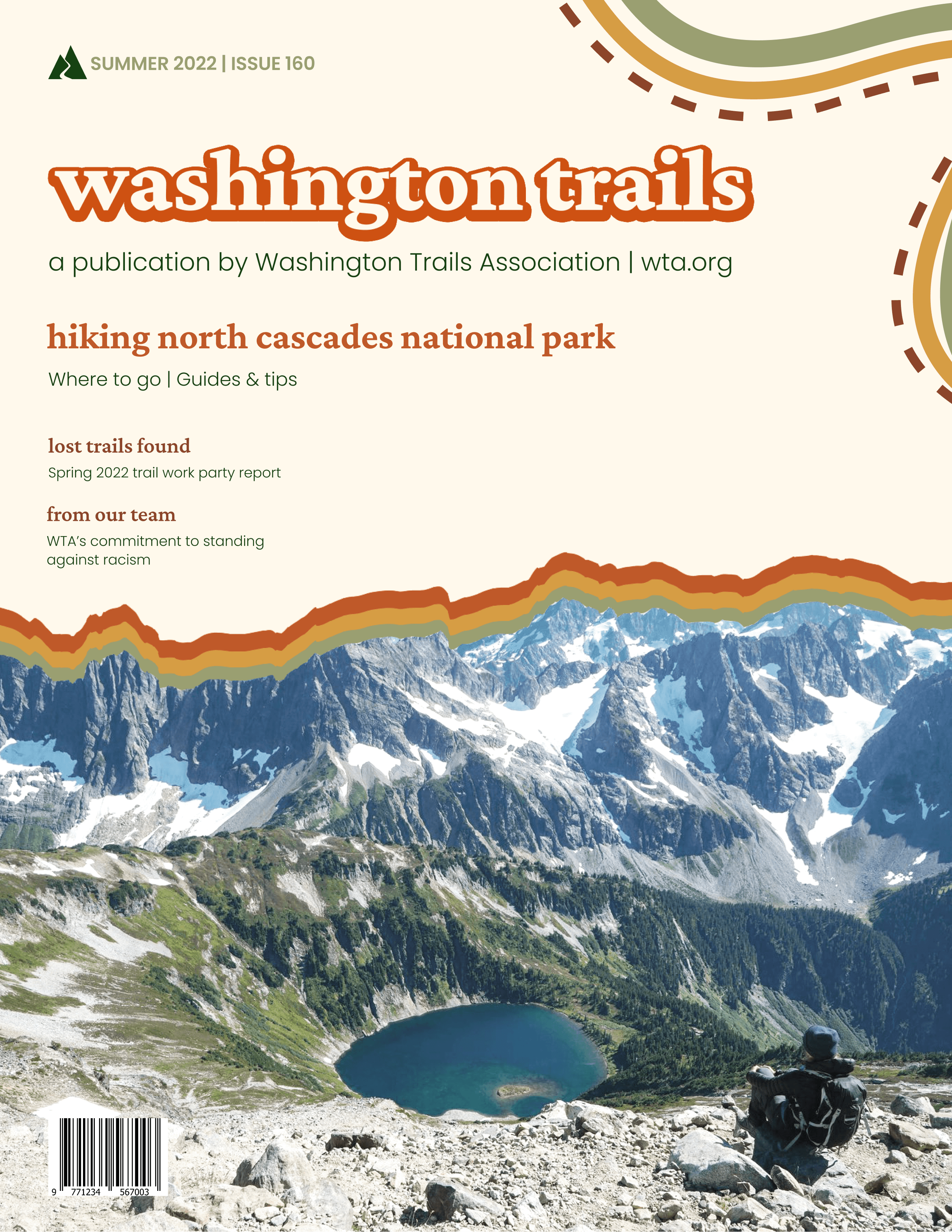
For my Master’s course, HCDE 508 Visual Communication, I was tasked with redesigning the visual design system of a “client” of my choice, Washington Trails Association (WTA). Starting from a mood board, I redesigned WTA'’s webpages and Washington Trails magazine. This process included creating wireframes, designing a new logo, and selecting typography, color palettes, and imagery.
I used WTA as an example client for this project. I did not work directly with or for WTA.
Contents
For this project, I designed:
WTA home page, desktop and mobile
WTA “Our Work” page, desktop
Washington Trails magazine cover and spread
WTA logo
Background
Communication Goals
✱ Calls to Action: Allow users to discover all that the Washington Trails Association offers by encouraging them to thoroughly explore the website and follow through on clear calls to action.
✱ Command and Hold Attention: Hold users’ attention through an appropriate balance between images and text, a logical hierarchy of elements, and a visual design that flows down the page, much like a trail.
✱ Inspire: Encourage users to interact with and volunteer for WTA through inspiring imagery that brings them into the outdoors.
✱ Trails for Everyone: Follow through on WTA’s “trails for everyone, forever” slogan by clearly and frequently showing users information on WTA’s work for equity and accessibility outdoors.
About Washington Trails Association
Washington Trails Association (WTA) is a Seattle-based nonprofit organization that shares information about hiking and runs programs to maintain and restore hiking trails in Washington state. WTA began in 1966 as Signpost magazine, in which hikers shared their experiences on trails in the Pacific Northwest. The target audience of WTA is all people in Washington interested in connecting with the outdoors, regardless of people’s identities or abilities.
WTA shares a combination of information about hiking and opportunities for people to get involved in events, volunteering, advocacy, and donations. People can use the WTA website to learn about hiking in Washington state, as well as information about advocating and volunteering opportunities.
Mood Board
Earthy tones, Polaroid photography, and WTA’s roots as Signpost Magazine in the 1960s and 1970s serve as the inspiration behind the mood board for this project.
Grid System
Web - Overview
WTA has a lot of information to share, and therefore a lot of content on their pages. The airy grid system gives users space as they traverse the page. Decorative curves are used to divide page sections, but also to guide users down the page, as if they were following a trail.
The grid system does not use rows. Instead, content is vertically spaced by multiples of the gutter size. A row-free system provides freedom to arrange different content in a variety of different layouts.
Desktop
12 columns, 20px gutter, 30px margins
✱ Text
4-6 columns. No text can occupy columns 1 & 2.
✱ Buttons
main - 2 columns and separated by a gutter. 20px rounded corners. Text inside is centered.
mini - Scaled down in proportion to main style buttons.
footer - In proportion with get trail news section of the footer.
✱ Images
large - 5 columns. Aligned to columns 2 & 7.
medium - 4 columns, in proportion to larger images.
small - 2 columns, in proportion to larger images.
full-page - Aligned to the edges. Variable height.
✱ Curves
large - 26px thick solid stroke.
medium - 17px thick solid stroke.
small - 8px thick solid stroke. Weaves from behind images and on and off the page.
✱ Vertical Spacing
By multiples of the gutter size (20px, 40px, 60px, and so on).
4-6 columns. No text can occupy columns 1 & 2.
Mobile
4 columns, 20px gutter, 30px margins
✱ Text
2-4 columns. Usually aligned to the margins.
✱ Buttons
main - Sized such that 3 buttons occupy a 4-column spatial zone with each button separated by 16px.
footer - Sized to fit 1 or 2 columns.
✱ Images
large - 4 columns. Aligned to margins.
medium - 3 columns, in proportion to larger images.
small - 2 columns, in proportion to larger images.
full-page - Aligned to the edges. Variable height.
✱ Curves
large - 26px thick solid stroke.
medium - 17px thick solid stroke.
small - 8px thick solid stroke. Weaves from behind images and on and off the page.
✱ Vertical Spacing
By multiples of the gutter size (20px, 40px, 60px, and so on).
Print - Overview
The print grid system is based on common magazine grid guidelines. The magazine cover is airy with a large organic image that occupies most of the page to draw the attention of the reader. The magazine spread is a mix between airy and welcoming to match the web grid system style, but also to guide readers across the pages and give the readers an opportunity to view a variety of different content on the page. Like the web system, decorative curves guide users across the page, as if they were following a trail. For the same reasons as the web system, a column-only system is used for print.
Magazine Cover
6 columns, 0.25in gutter, 0.5in margins
✱ Text
2-5 columns aligned to the left margin.
✱ Images
One full page-width image, aligned to the bottom of the cover.
✱ Curves
large - 17.33px thick solid stroke.
medium - 11.33px thick solid stroke.
small - 6px thick solid stroke. Weaves around the upper right-hand corner.
✱ Vertical Spacing
By multiples of the gutter size (0.25in, 0.5in, 0.75in and so on).
Magazine Spread
12 columns, 0.2in gutter, 0.5in left/right & 0.625in top/bottom margins
✱ Text
5, 7, & 12 columns. Usually aligned to the margins.
✱ Images
large - 7 columns. Aligned to margins.
medium - 5 columns, in proportion to larger images.
small - 3 columns, in proportion to larger images.
full-page - Aligned to the edges. Variable height. Width is maximum a single-page, not the entire spread.
✱ Curves
large - 17.33px thick solid stroke.
medium - 11.33px thick solid stroke.
small - 6px thick solid stroke. Weaves from left edge to right corner behind image frames.
✱ Vertical Spacing
By multiples of the gutter size (0.2in, 0.4in, 0.6in and so on).
Typography
Crimson Pro
Crimson pro is a modern serif typeface with open and round counters, and even strokes. This typeface works well in bold weight for retro-style typography, made using drop shadow. It also is comfortable to read in longform - WTA publishes its own magazine. While Poppins is the primary body text, crimson pro is a viable alternative and is used for call outs throughout print and web designs.
Poppins
Poppins is a geometric sans-serif typeface that is a modern and complimentary type to crimson pro. Its tall x-height makes it feel welcoming, prompting the user to spend more time reading all of the information on the page. It pairs well with Crimson Pro to give WTA’s content a modern and professional feeling.
Color Palette
Theory
A triadic-leaning color scheme was chosen to create a visually-rich and balanced design. To best match the colors found throughout the outdoors in Washington state, hues of neutral and yellow-green were chosen. The vibrant orange color is used to bring excitement and energy. The greens and brown, as organic hues, are used throughout designs and materials to ground the user.
Accent colors (brown, forest green, and yellow) are used to guide the user’s eyes down the page without drawing away their attention. A light tint of yellow was chosen for the background to highly contrast the dark green text such that the body text doesn’t completely recede.
Inspiration
WTA’s color palette is inspired by muted tones of retro and 1970s style. The green hues are evocative of the forests of the Pacific Northwest, while the brown and yellow hues represent the desert of Eastern Washington.
Logo
WTA’s logo is a mountain shape with a cut out that cascades down from the mountain’s valley. The mountain represents the various ranges in Washington state, while the cut out resembles trails that WTA seeks to protect.
The logo primarily exists as the primary green, with “washington trails association” in Poppins bold type cascading down the right side of the mountain. This version of the logo is used for the majority of cases, including web, print, and physical materials such as trail worker hard hats.
The logo without the client’s name is placed on the magazine cover next to the issue number. It is also used for small decorative materials, such as stickers. The logo should be placed on top of solid backgrounds or simple patterns and should not occlude any images in print or on web.
Imagery
Polaroid- and Retro-Inspired
Because the WTA visual system is retro-inspired, the imagery is likewise inspired by vintage and polaroid photography. Small, medium, and large images are framed with thick right & bottom borders and thin left & top borders, taking after polaroid frames and retro typography style. Full-page images have the sky/background cut out, and have cascading colored layers to similarly mimic retro typography styles.
The images used throughout the system are a mix between outdoor spaces in Washington state and people working on and for trail restoration and justice through WTA. These images are adjusted to appear vintage and taken with a film camera, as described in the style guidelines.
Magazine Cover & Spread Design
I designed the magazine cover and spread in Adobe InDesign and Figma. View the magazine design here.
Next Steps, Challenges, & Learnings
Future Enhancements
✱ Keep tinkering with the design
I loved this project, and if given the time, I would go back and keep fixing and modifying things as I see fit.
Challenges & Learnings
✱ Redoing the entire project from scratch
What I don’t show in this project page in detail is that I scrapped almost my entire design right before the project was due. I had started with a completely different mood board that was focused on being immersive, soft, and earthy. I was particularly inspired by Bon Iver’s Bon Iver album cover and typography that blended into nature. When it came to adding imagery to my designs (one of the last steps in the process), I used Photoshop to edit images to adjust the opacity at the images and allow them to blend into the background. My original designs were soft, immersive, and earthy, but they were overwhelmingly ethereal. Washington Trails Association is a great organization that does a lot of impactful work in outdoor spaces across the state, which doesn’t align with ethereal at all.
With no ideas of how to fix it, I went back to the drawing board, literally. After spending quite some time on Pinterest and other inspirational websites, I went in a 70s, retro direction that you’ve see throughout my final designs. I did keep some elements of my original designs, but overall, it was a very painful process to redo almost everything. What I’ve learned from this experience going forward is to have a mental model to better envision how a design will look from initial concepts so that I can stop bad ideas in their tracks.